Every project has a moment where something snaps into place. For this plugin, that moment took years and an AI assistant to arrive.
I built the first version of Responsive Preview long before AI coding existed. The idea was simple: wrap your WordPress site in an iframe with a toolbar that let you switch between fixed viewport widths. Desktop, tablet, mobile. It worked, technically. But my real responsive QA lived in the macOS simulator tools, and my cross-browser checks ran manually across Chrome, Opera, Safari, Firefox, and Edge. The plugin was something I’d built, not something I depended on. More novelty than tool.
That changed when I started working AI into my development workflow.
What It Took to Make It Useful
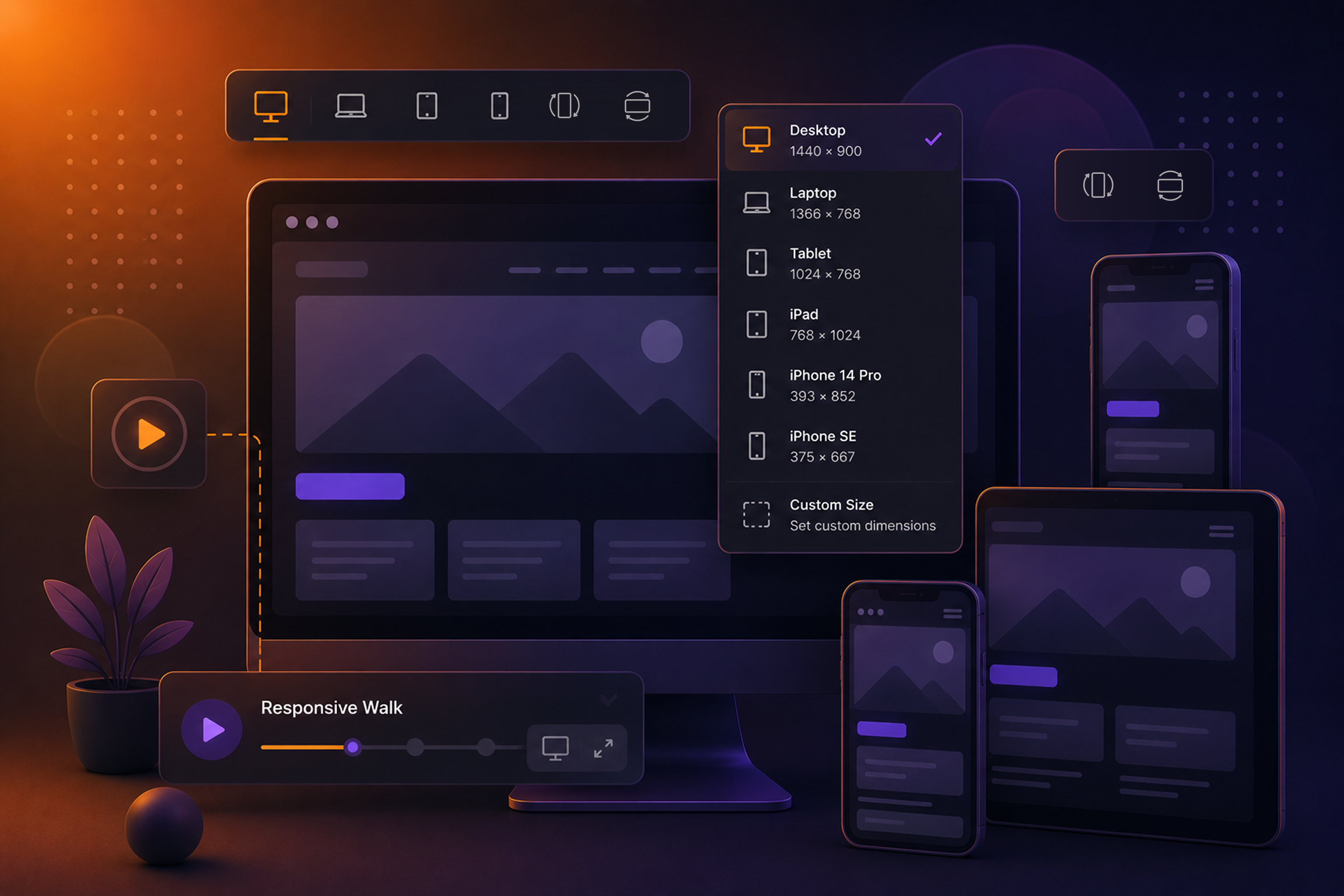
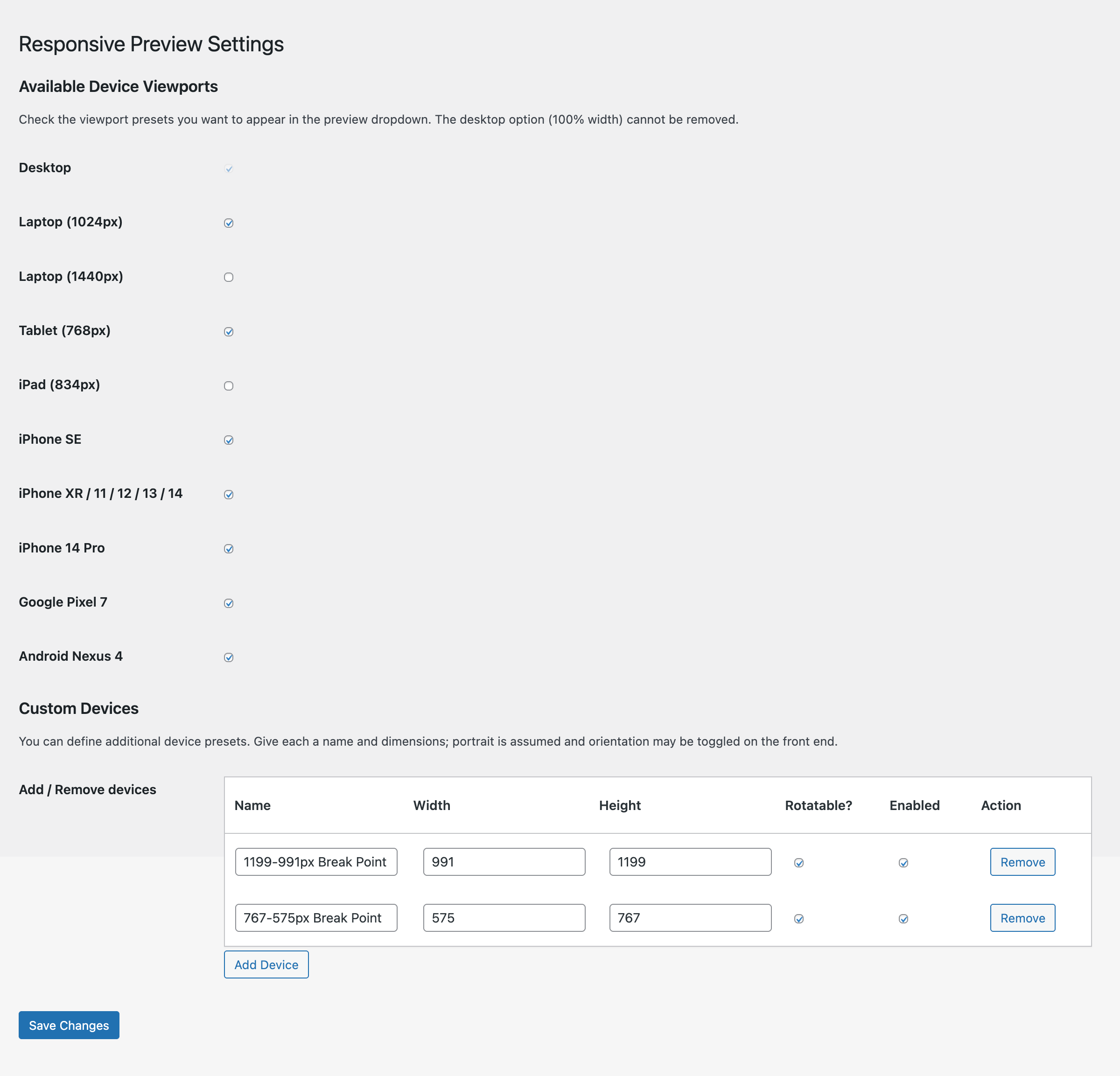
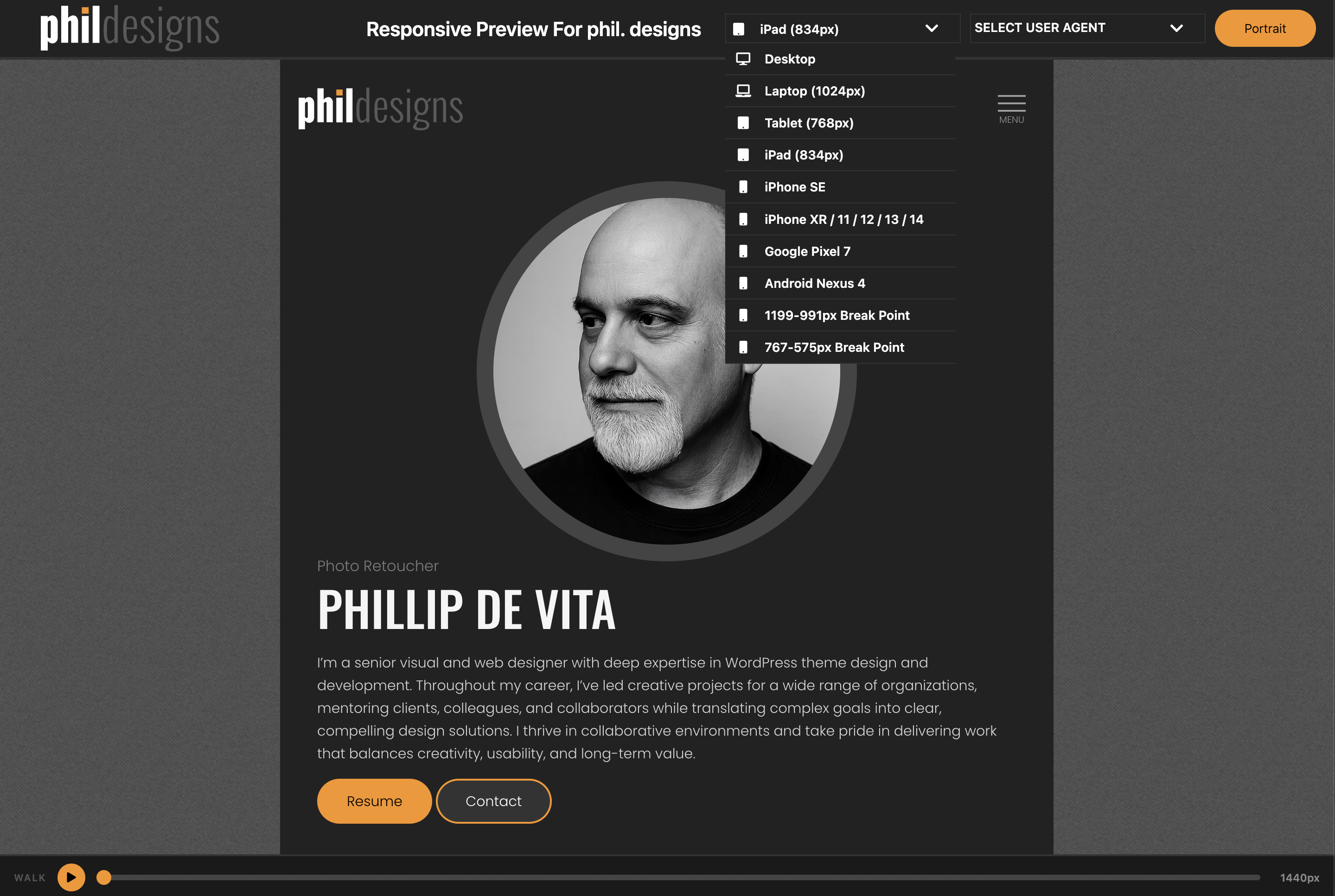
Working with Claude, I went back and rebuilt it properly. The toolbar got a flexbox overhaul. The orientation toggle came out of the dropdown and got its own button. Custom device management came in, so you’re not locked into preset widths. You can enable or disable individual viewports to keep the toolbar clean. User agent selection got added for when you’re debugging behavior tied to device detection rather than just screen width.
But the feature that made this a plugin I actually reach for is the responsive walk.
If you’ve done responsive QA, you know what a responsive walk is; slowly condensing the browser window to catch layout breaks that only appear between standard breakpoints. The kind that don’t show up at 768px or 1024px because they live somewhere in between. Traditionally you do it by hand, dragging the browser edge slowly across the screen and watching for things to break.
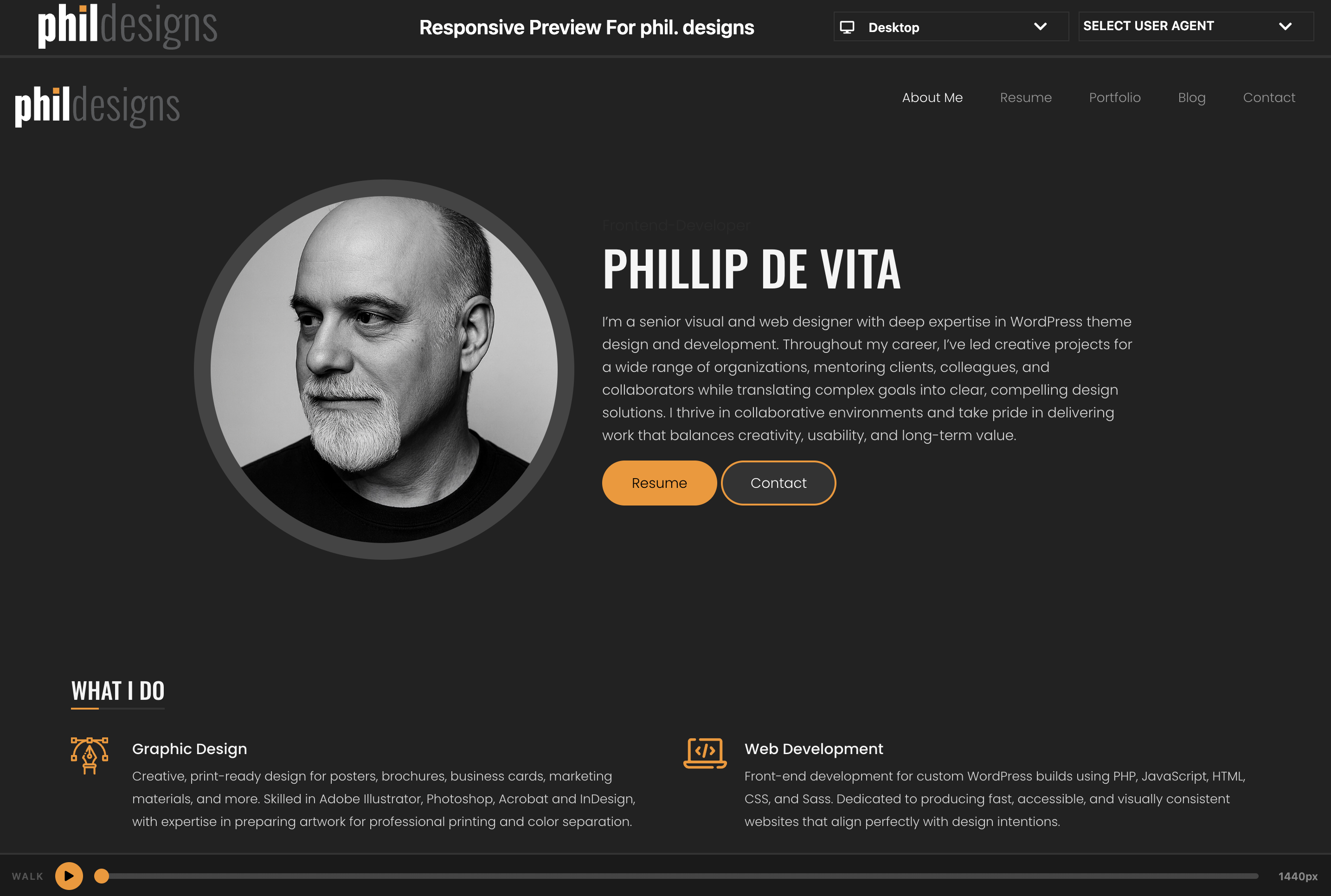
The plugin automates that, but what makes it useful is the interface built around it. Think video playback controls. There’s a play button that starts the walk, a progress tracker, and a live pixel width counter so you always know exactly where you are. You can pause it when something breaks, and scrub the progress tracker to pinpoint the exact pixel width where the layout falls apart. Then you go fix it.
What It Does Now
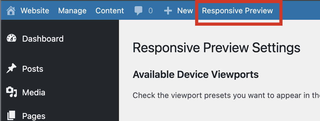
Responsive Preview adds a preview toolbar accessible from your WordPress admin bar. Click it and your site opens in a new window inside the preview shell.
From there: switch between preset viewport widths, toggle portrait and landscape orientation, define and save custom device widths, enable or disable individual viewports, switch user agents, and run the responsive walk with full playback controls to catch the breakpoints you didn’t know you were missing.
The Honest AI Angle
This isn’t a plugin I vibed from scratch. The original version predates AI coding by years and honestly lived most of its life as a novelty. What AI gave me was the ability to close the gap between what it was and what it should have been — faster than I could have managed alone, and with better results than another solo iteration would have produced.
The responsive walk is a good example of that. I knew the behavior I wanted. Working through the mechanics and the playback interface with Claude is what turned it from an idea into something that actually works the way a developer needs it to.
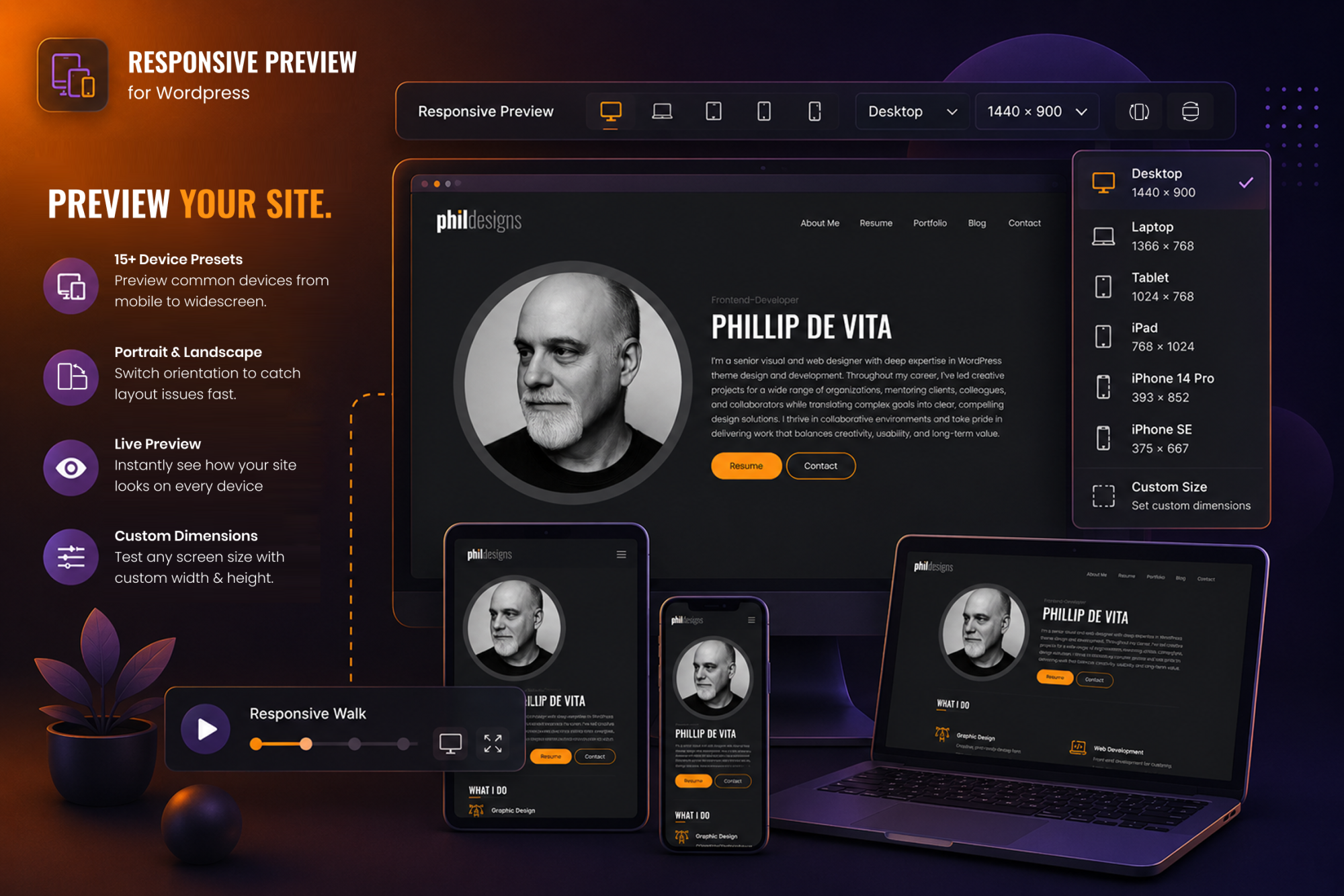
Get it! The plugin is open source and free to use!
Download it off my GitHub Download it from WordPress
If you’re doing client QA work in WordPress, it’s worth adding to your setup.
Have a feature request or found a bug? Let me know!